
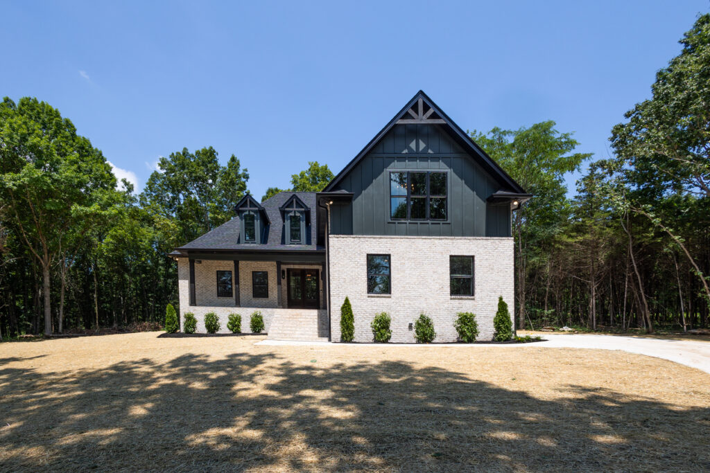
Choosing a soft white paint for your custom home sounds simple – until you’re holding 12 sample chips that all look the same. SKC shares the three go-to soft whites they trust on every project.
There’s a reason white is the most chosen paint color in American homes. Done right, it’s clean, timeless, and endlessly versatile. Done wrong, it’s stark, cold, or weirdly green under your kitchen lights.
The difference almost always comes down to which white you choose.
At SKC, the team is asked about paint colors constantly – and for good reason. After building and renovating homes across Lebanon, TN, Mt. Juliet, and the greater Nashville area, SKC’s designers have developed strong opinions about which soft whites deliver consistently beautiful results, regardless of lighting conditions, room size, or architectural style.
Here are their top three recommendations, and exactly why each one earns its place on the list.
Why Soft Whites Work Better Than Bright Whites in Custom Homes
Before diving into the specific colors, it’s worth explaining why the team gravitates toward soft whites rather than pure, bright whites.
Bright whites (think zero-tint, stark white) look clean on a paint chip but often read as cold, clinical, or harsh in a finished room – especially in spaces with mixed lighting or warmer wood tones. They can also make imperfections in drywall and trim more visible.
Soft whites, on the other hand, have subtle undertones – cream, gray, or greige – that create warmth and depth without adding color in an obvious way. They work with a wider range of flooring, cabinetry, and trim choices, and they age beautifully over time.
For custom homes built to last – which is every home SKC builds – soft whites are the professional choice.
The SKC Top 3: Best White Paint Colors for Home
1. Swiss Coffee (OC-45) by Benjamin Moore
Swiss Coffee is a creamy, warm white with just the right amount of depth. It reads as white in almost every context, but it never feels sterile. The warmth comes from subtle beige and cream undertones that make rooms feel cozy and welcoming without adding obvious color.
Why it works:
– Universally flattering – pairs well with warm wood tones, stained floors, and natural stone
– Performs beautifully in rooms with limited natural light where a cooler white would feel flat
– Has enough warmth to make large, open spaces feel lived-in rather than museum-like
Best used in:
– Great rooms and living areas
– Bedrooms and nurseries
– Kitchens with warm-toned wood cabinetry
– Homes with lots of natural wood or exposed beam details
Swiss Coffee is a popular choice in SKC’s custom homes because it’s warm enough to feel inviting but neutral enough to work with virtually any finish. It’s especially beautiful in open-concept designs where the same wall color flows from the main living area into adjacent spaces.
2. White Dove (OC-17) by Benjamin Moore
White Dove is a classic – and it earned that status by being genuinely versatile. It’s a soft white with subtle gray undertones that keeps it from reading as warm or yellow, making it one of the most balanced whites available.
Why it works:
– The slight gray undertone prevents yellowing over time and in artificial light
– Works equally well in traditional, transitional, and modern farmhouse styles
– Pairs seamlessly with white and off-white trim – a common choice in custom home millwork
– Reads clean and fresh without being stark
Best used in:
– Throughout the entire interior for a cohesive, flowing palette
– Rooms with cool or north-facing light where a warmer white might fight the existing tone
– Modern farmhouse and transitional-style homes
– Cabinets (White Dove is a go-to cabinet color as well as a wall color)
One of the things the SKC team appreciates about White Dove is its consistency. It’s a “works everywhere” white that doesn’t require constant re-evaluation as you move from room to room. For clients who want a clean, unified palette throughout their home, White Dove is often the starting point.
3. Cloud Cover (OC-25) by Benjamin Moore
Cloud Cover is the lightest and most airy of the three – a sophisticated white with a crisp, barely-there quality that adds freshness without the harshness of a pure white. It sits at the cool end of the soft white spectrum, with just enough tone to prevent it from feeling clinical.
Why it works:
– Adds a light, bright quality to spaces that need visual breathing room
– Works beautifully in rooms with abundant natural light where warmth isn’t needed
– Creates an elegant backdrop that lets architecture, finishes, and furnishings take center stage
– The slight softness prevents the stark “hospital white” feel of pure whites
Best used in:
– Primary bathrooms and spa-like spaces
– Rooms with white or light gray cabinetry
– Modern and transitional homes with clean architectural lines
– Spaces where the goal is to maximize the sense of light and space
Cloud Cover is a particularly good choice for bathrooms and laundry rooms in custom homes – spaces where cleanliness and brightness are priorities, but where a pure white would feel too aggressive. It walks that line well.
Choosing Between the Three: A Quick Guide
Not sure which of the three is right for your home? Here’s a simplified decision framework:
| If you want… | Consider… |
|---|---|
| Maximum warmth and coziness | Swiss Coffee (OC-45) |
| Balanced, timeless, works-anywhere white | White Dove (OC-17) |
| Light, airy, crisp freshness | Cloud Cover (OC-25) |
The good news is all three are beautiful, and all three are proven performers in Lebanon, TN homes across a variety of styles. The “wrong” answer here is genuinely hard to make.
A Critical Note on Paint Color Selection
One thing the SKC team always reminds clients: paint colors look different on screen than in person.
The colors on this post – and on any paint chip card you find online – are affected by your screen’s brightness, contrast, and color temperature settings. What looks like a warm cream on your phone might appear almost white on a different screen.
The only way to truly evaluate a paint color is to:
1. Get a physical sample or sample pot
2. Paint a large swatch (at least 12×12 inches) on your actual wall
3. Evaluate it at different times of day – morning, afternoon, and under your evening lighting
This is standard advice in the SKC design process, and it’s the difference between a color you love for 20 years and one you repaint in 6 months.
How the SKC Design Process Handles Color Selection
When you build a custom home with SKC, paint colors don’t get chosen in isolation from a catalog. The team’s in-house designers – Ashleigh and Kyla – guide clients through selection meetings where every design element is considered together.
That means wall colors get evaluated alongside:
– Flooring and tile selections
– Cabinet finishes
– Countertop materials
– Trim and millwork choices
– Lighting fixtures
This holistic approach is what separates a home that feels designed from one that feels assembled. Every element works with the others, and every selection gets the attention it deserves before a single brush stroke is applied.
Ready to Design Your Custom Home?
If you’re planning a custom home build or a renovation in Lebanon, TN, Mt. Juliet, or the greater Nashville area, the design conversation starts early at SKC – and that includes paint.
Follow SKC on Facebook or Instagram to be the first to know about upcoming Meet the Builder events. contact the team directly to schedule a consultation and talk about your project.
All three recommended colors are by Benjamin Moore. Actual colors may vary based on screen settings and lighting conditions. For accurate representation, obtain physical paint samples and test in your space.
SKC builds custom homes and handles renovations, room additions, and outdoor living spaces across Lebanon, TN, Mt. Juliet, Wilson County, and Middle Tennessee.